Projects and Self-Portraits
Get ready for a deep dive on hand painted canvas backdrops. I’m about to photography/DIY nerd-out.
This weekend I finally had the time and the good weather to paint my own backdrop. I bought these materials way back in December with the intention of painting, but was never able to quite make the time.
This is the second backdrop that I have done. The first had more earthy tones that tended to photograph warmer, but which also was complementary to a wide range of skin tones. For this backdrop, I wanted to maintain a universal color that could photograph well with diverse skin tones, but also photograph cooler if I chose. After much thought, I chose Intellectual Gray by Behr. https://www.behr.com/consumer/ColorDetailView/PPU18-19. as my main color.
The process by which I paint my backgrounds requires two paints—a primary color and a secondary color. I chose Behr Ottertail https://www.behr.com/consumer/ColorDetailView/N220-5. This has slightly warmer tones to balance the cooler tones of the primary color.
As a note, this is the way I paint my backdrops—there are so many ways to paint a backdrop, this is just what I have found works for me on the two I have done. I think the process would be much different if you chose to incorporate tertiary colors.
JV on my first backdrop with “his” ladder
Black and white of same backdrop
The first time I painted a backdrop, I scoured the internet for articles and DIY videos. I watched a lot of videos. Some were helpful and some were not. The most helpful videos and articles I have found I will be linking throughout this article. First up, a great article from Mastin Labs here: https://mastinlabs.com/photoism/articles/how-to-build-painted-canvas-backdrop-on-a-budget and of course, Sue Bruce was an excellent resource as well: https://suebryceeducation.com/course/backdrop-painting/ (paste this link, it isn’t hyperlinking here). Note that Sue Bryce’s video comes with her courses, but she also has a detailed article here: https://suebryceeducation.com/blog/painting-canvas-backdrop/. But also her courses are so amazing.
Of course the goal is to look like an Oliphant backdrop. You know, the beautiful backdrops used for Vogue covers: https://www.oliphantstudio.com/ If you’ve never heard of backdrops, you’ve still seen an Oliphant on the cover of Vanity Fair. They are beautiful in tones and craftsmanship. Besides Oliphant, there are other beautiful background artisans like Franklin https://franklinbackdrops.com/ and Telecia Lee https://franklinbackdrops.com/ . You’ve also seen these backdrops with major artists like Lauren Daigle, who was photographed by Jeremy Cowart (also well worth a follow) https://www.facebook.com/TeliciaLeeBackdrops/posts/1856165681105328.
Obviously, each of these artisans have spent years perfecting their craft, and any backdrop that I attempt will not be of the same quality of an Oliphant or a Franklin or a Lee. But that doesn't mean you or I shouldn't have fun, experiment with color, and do something out of the ordinary. It's okay to just have fun with photography. Really. Promise.
So, as you can see from many of these backdrops, there is texture but not extreme variations in color. Too much color is, in my opinion, too busy, and I’m not about that personally for a backdrop. Small details that blend are good, extremes are aesthetically unpleasing to me. That’s my goal, slight visual interest that doesn’t compete or impede the subject.
One of the ways to select a color with these parameters is to get a ton of paint swatches. Select the color you like, then go up one or two colors above that for your secondary. If I could remember the source for that tip, I would link it because it is a great tip. It may be in this video, which is also a great resource and makes me want an air painter https://www.youtube.com/watch?v=95HEJbdoiVU&t=322s.
So, materials. This unprimed canvas was recommended: https://www.amazon.com/gp/product/B01MSSNJGG/ref=ppx_yo_dt_b_search_asin_title?ie=UTF8&psc=1 and that’s what I’ve used for both backdrops. This is just a simple painter’s drop cloth. Now, there is a huge difference between unprimed (what I purchased) and primed canvas. A primed canvas already has a coating on it and you can immediately begin painting with your primary color. If, like me, you are using unprimed canvas you MUST apply a primer first. Canvas is thirstier than Joe Exotic and the initial paint that you put on will just be immediately absorbed. So it is critical to prime it. On the first canvas, someone accidentally purchased Kiltz gray primer: https://www.kilz.com/primer/kilz-2-gray. I am not going to say who purchased the gray accidentally, but turns out it was a solid choice. It absorbs well and doesn’t interfere with the primary color, at least in my experience.
So you have your canvas, your primer, your primary and secondary colors—what else? You need paint rollers. Get this roller: https://www.homedepot.com/p/9-in-x-3-8-in-Microfiber-Paint-Roller-Cover-3-Pack-HD-RS-1733/203230113. Get it. Don’t waste your time with any of the cheap foolishness. Get. This. Roller. It spreads paint evenly like a champ. Get it.
Now for texture, I use this: https://www.homedepot.com/p/QEP-7-1-2-in-x-5-1-2-in-x-1-7-8-in-Extra-Large-Grouting-Cleaning-and-Washing-Sponge-3-Pack-70005Q-3VP84/203260188. That’s right, a normal-ass sponge. Nothing special about it. This is the primary tool I use for texturizing. I did branch out and try this https://www.homedepot.com/p/9-in-x-3-8-in-Loop-Texture-Roller-Cover-RC119/100191515 but I thought the effects were too drastic. If you watch the video links, you will see everyone has their favorite texturizer. It just depends on the look you are going for.
Before painting, unroll your canvas and iron it. This will get out a lot of potentially unattractive and distracting wrinkles. Once you’ve done that, lay the backdrop down on a clean surface. I don’t have a surface big enough and clean enough at home, so I use my driveway and lay visquine down . If you are adventurous, you can do it in your home https://www.youtube.com/watch?v=14Aiv8XQPBM. But just watching this gives me anxiety TBH.
So we’ve laid out our backdrop and we are ready to paint. Remember, prime first. It takes about forty minutes for me to do the whole 9x12 canvas by myself. And it dries within 30 minutes. Next, get a new roller and paint your primary color. Let it dry for about 30 minutes. Then get ready for the real work—texturizing.
To texturize, first make a blend of the primary and secondary colors. Just a mixture that is to your liking. Add a little water.
With texturizing, remember that perfection is the enemy of the good. It doesn’t have to be perfect, but it does have to blend. How to blend? This is where I find the work to be difficult physically. I take my sponge, dip it in water and a mixture of the primary and secondary paints. Then drag it, sponge it, wipe it. Make large strokes coming OUT FROM THE CENTER. I want my backdrop’s center to be slightly lighter than the exterior. So that’s how I accomplish that. Also, feel free to walk on the backdrop, just make sure you aren’t leaving footprints. If the paint is sufficiently dry, this shouldn’t be a problem. Texturize to your liking. Don’t be afraid to wet the canvas. Although there is a possibility that you can oversaturate the canvas, I have not had this occur, and I often feel like I am using quite a lot of water. I did about five washes of the primary/secondary mixture on this canvas. It is laborious and exhausting in my opinion, so be prepared for that.
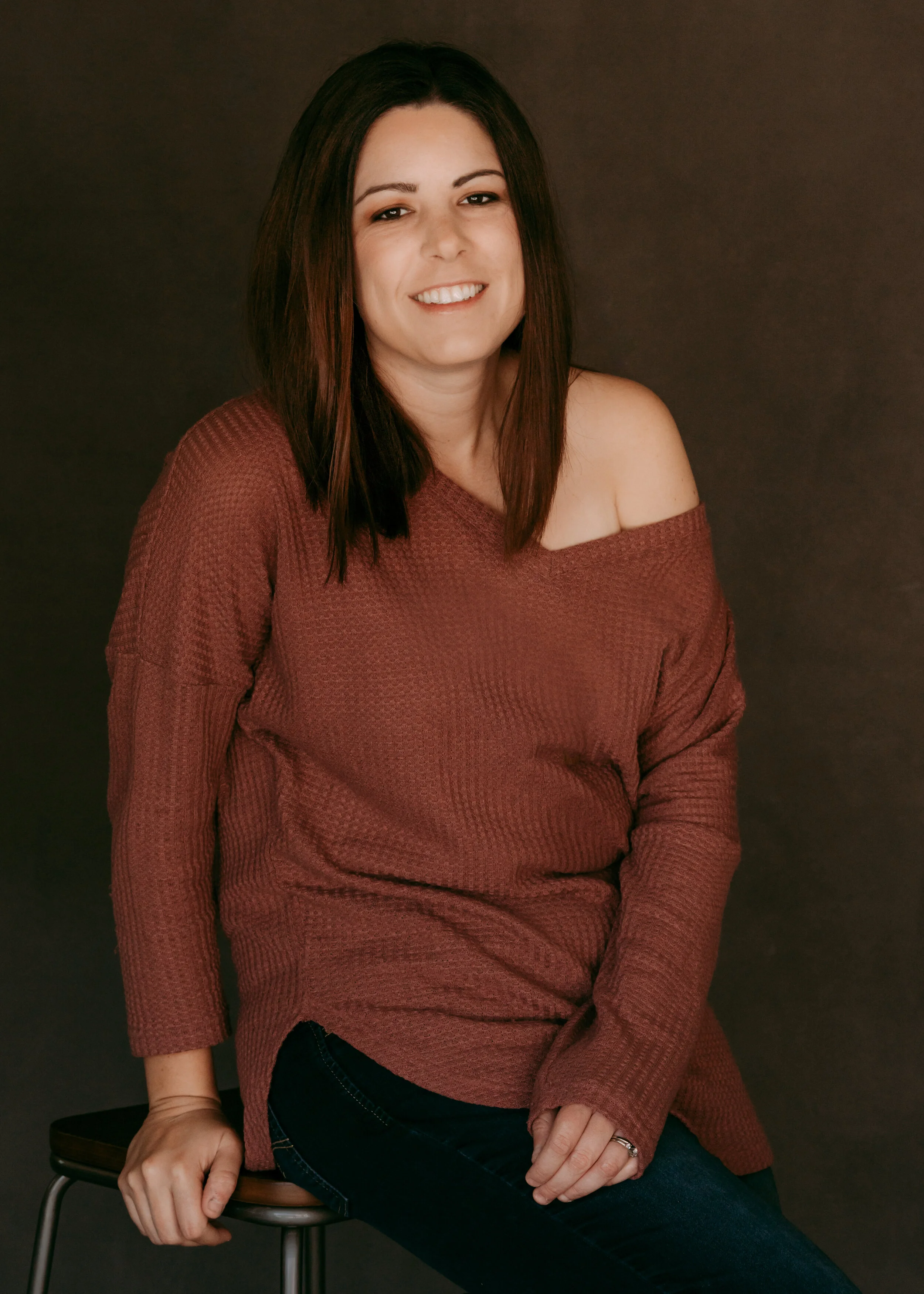
When you are done, hang it up for a few hours and it should be ready for shooting. The pictures below were all taken with this new backdrop the day after we painted it.
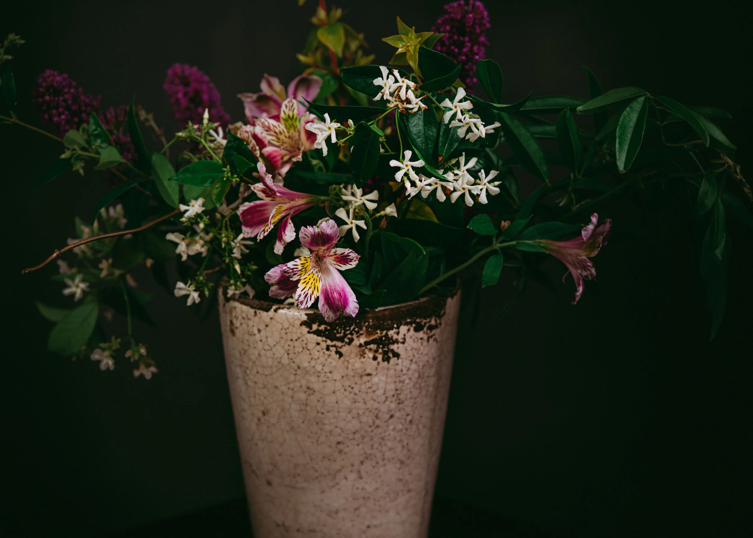
Shout out to Matt for taking these photos of me, which I really adore*. I think he has an excellent eye. As you can see, this color can photograph both cool, like the flowers, neutral, like the second photograph, and warm, like the last several. The textures in all of these is the texture of the backdrop, there is no texture post-processing.
These were all shot with the Sony A7R3 and 90 G. The flowers were at f 3.5 and the portraits were at f 5.6. For my light set up, I had a Godox AD600 as my main light in a 45” Glow Octa. I feathered that one a lot. The secondary light was camera left with an AD200 in a Godox softbox. I think that softbox is 32”—it’s a small one.
I edited these with (I think) Tricia Victoria and Small presets. Of course there was also a little bit of hand editing and tweaking.
In all, I’m very pleased with this new backdrop and I’m looking forward to shooting more with it. Now I am thinking of the next canvas—maybe in the fall!
* I’ll be making another post about these self-portraits on another blog because I have a lot of thoughts about what it means to take a portrait as a 30-something lady:)


